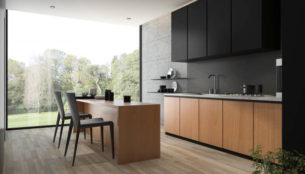
Decorating kitchen benches
We’re all stuck in our homes more because of Coronavirus, so I thought it would be fun to share some of my favourite kitchen styling ideas.
This post contains tons of inspiration from creative people all over the internet and some styling tips from me. This project might help you to see what you have been doing wrong. Whatever the outcome, your goal is to increase your confidence in-home styling!
This mood board contains everything you need for a stunning kitchen.
Style and colour are the priority
Before we jump into all the details about kitchen styling, let’s first address the first step: What is the overall vibe of your vignettes?
Look at the design elements of your kitchen. Do you want a modern, sleek black-and-white kitchen? You can choose to keep it simple and neutral by choosing pieces in neutral tones, or to add a splash of colour against it. Both methods work. However, the former is easier on the eyes and the latter is more impactful.
Your kitchen’s vibe might be more rustic, like the one shown in the photo below. Therefore, you will want to include benchtop items that are in line with this aesthetic. For example, you don’t want a modern toaster in a beautifully weathered kitchen. It will feel like a mistake. We don’t want to see you make those mistakes.
Serving boards are your friend
Serving boards are a must-have for decorating your benchtop. Serving boards are a great addition to any kitchen design. ).
Firstly, texture! Splashback tiles are a common feature in any kitchen. You can add warmth to your space by including a wooden serving board.
Serving boards also give you height. This is an important element in a countertop vignette. It draws the eye upwards when you place two of them against tiles in your kitchen. You can use rectangular boards or mix it with round ones.
I would avoid putting two circular boards together. Yes, you can have two rectangles of different sizes. Two rectangles of different sizes, no.
Both depth and height are essential
Your kitchen countertop vignettes should have depth. It’s not possible to place three items side by side. It will feel boring and flat. You should have something behind the benchtop (or shelf) and something in front. Then, something to the sides.

